Recently, I was going through the user experience of recharging a prepaid mobile on freecharge.in and I found couple interesting insights. Lets look at this website from a users point of view, lets call him Bobby who is a businessman and uses the internet once a week.
Freechange.in is beautifully build, it’s clean and pleasant.
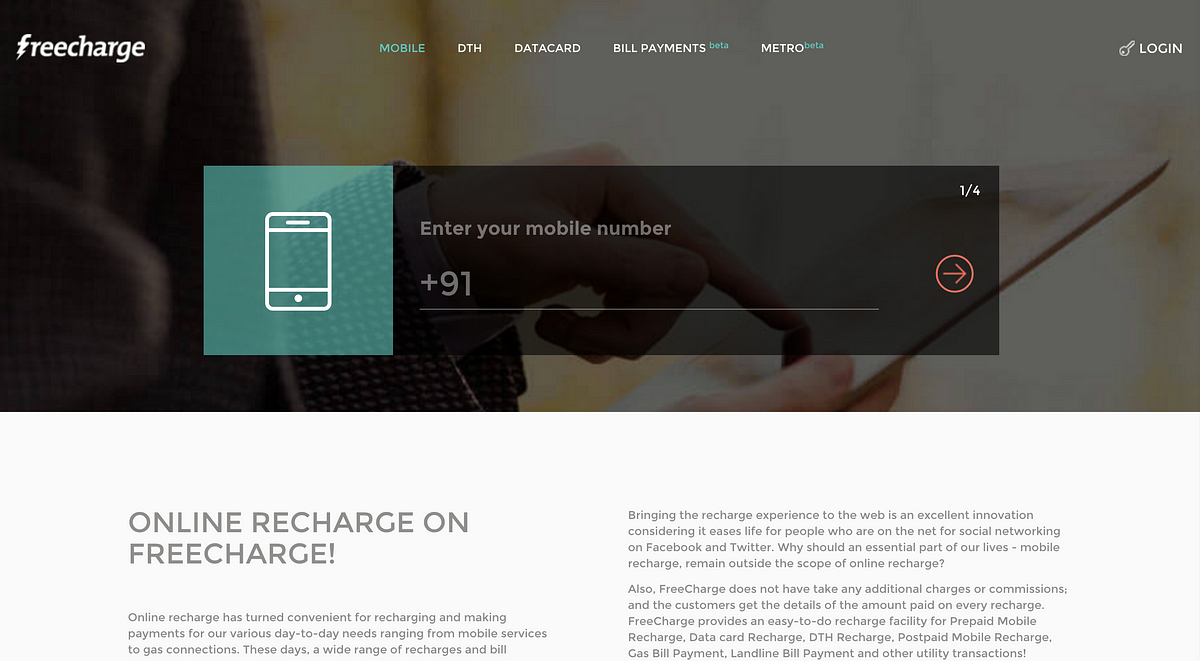
Bobby wants to recharge his prepaid mobile as fast as possible, So he googles it and find freecharge.in.
-
Clear: Bobby has to enter his mobile number to recharge, as there is a huge input to enter the mobile number.
-
Confusing: The steps on the top right say (1/4), He understood that recharging mobile will take 4 steps, but that’s too much of waste of time, everything happens now in one click, He might look at some other sites which can recharge less than 4 steps.
On the next section, there is huge text information under “Online recharge on freecharge”. Should Bobby care about reading this information before he rechanges? Most of the user are lazy.
People rarely read Web pages word by word; instead, they scan the page, picking out individual words and sentences. How users read on the web.
Consider the Bobby don’t read this text and scrolls down and this is what he see

- Confusing: Bobby came to recharge a prepaid mobile and what user see is logo’s of fast-food and beverage brands! He is confused what is this for? He scrolls back and read the huge lines of text then decides he doesn’t care about it.
Bobby scrolls down and see another section with more color to it
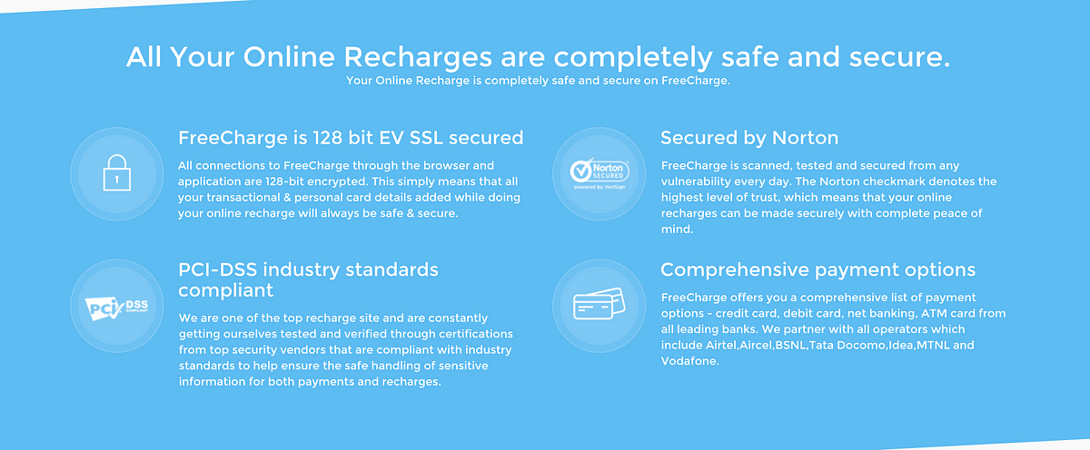
- Confusing: Bobby doesn’t even understand the terms over here, should he care about this for recharging his prepaid mobile ? He ignores it and continue scrolling.
-
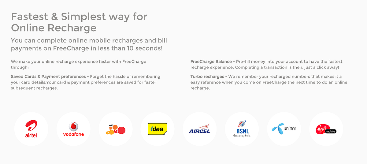
Clear: Logo’s of the network provider makes a clear sense that Bobby is on online recharge website, this also increase the credibility of the website.
-
Confusing: When Bobby reads the tiny length text above, he is confused that it’s not related the logo’s below it and text describe the features freecharge is providing which Bobby doesn’t even care about as only thing he wants to do is to recharge his prepaid mobile.
Bobby scrolls up to top of the page to recharge

Bobby enters the number and he is slightly confused what to do next, there is a huge image which look like a button, he tries clicking on it nothing happens, then he sees a right arrow and clicks on it .

It asks for prepaid/postpaid and prepaid is already selected, so Bobby click on the right arrow.

It asks for which operator ? and by default Vodafone is selected, so Bobby click on the right arrow.

It asks for recharge amount, So Bobby enters Rs.100/- and it says this is last step (4/4), so Bobby clicks on the right arrow.
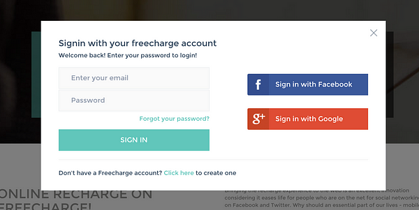
Suddenly a modal shows up with login details! why should Bobby sign up for recharging a mobile? Bobby decides to close the modal and check for other options which freecharge provides.

Page suddenly refreshes and all the data he entered is gone. Bobby is really confused and felt this website doesn’t work and leaves.
Conclusion
Website is designed well, but there are lots of usability issues. For Bobby, it was difficult to recharge his prepaid mobile from a website which does only recharging.
Small things can really help in fixing some of the issues, I will some of the fixes
Reduce the amount of text/information of the website. Using Concise Text, Scannable layout and Objective language will easily boost the Usability. Read more about it on how users read on the web.
There is a clear miscommunication on the website, its say 4 steps to recharge, but it takes more than 4 steps! sign up and payment setup should be part of these steps. There should be a clear communication about the sign up before the user can recharge.
Broken user-experience when user closes the signup modal, the page refreshes and the user loses all the information he entered.